You know that your call to action is vital.
The right CTA can boost conversions, attract passionate email subscribers, and secure lifelong clients.
But every time you try to write a killer CTA, you end up with something clumsy, awkward, and ineffective.
Let’s remedy that, shall we?
By the end of this article, you’ll have six powerful tips and 50+ practical examples of CTAs that will surprise, delight, and convert readers into buyers.

Master the Art of CTAs: 6 Power-Packed Tips to Captivate Your Audience
Whether you need an effective cta for social media posts, email marketing, a blog post, a Facebook ad, or even Google ads, we are here to help.
So check out these six power-packed tips that will captivate your audience and elevate your call to action game.
1. Simplicity Sells: Create Crystal-Clear CTAs That Drive Results
Nobody likes a confusing message.
So, why make a visitor guess what you want them to do?
Let’s talk about the importance of clarity in your CTAs.
Use Clear and Concise Language
Get straight to the point. A potential customer doesn’t have time to decipher cryptic messages.
Keep your CTA button short and sweet, with a clear, direct message.
For example, Dropbox‘s simple “Try it for free” CTA button has played a significant role in the company’s rapid growth.
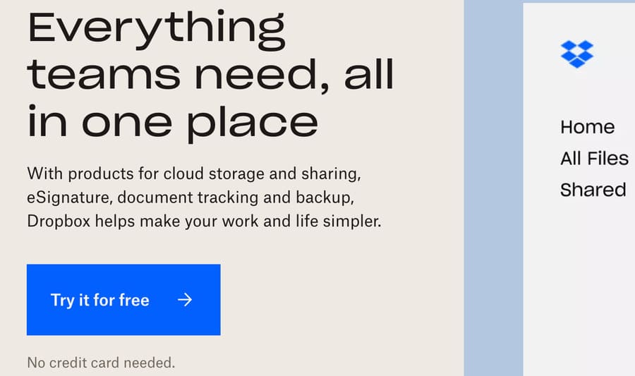
The clear message and straightforward design have encouraged millions of users to sign up for their file-sharing service.
Be Specific
Don’t just tell ’em, show ’em!
Your CTA should make it crystal clear what your audience should do next. Let’s check out this call to action example:
“Sign Up Now for Your Free Trial”
Vs.
“Join Us”
In the first option, it’s evident that users need to sign up for a free trial.
The second one? Erm, not so much.
Spotify has seen tremendous success with its CTA, “Get 3 Months For £0.”
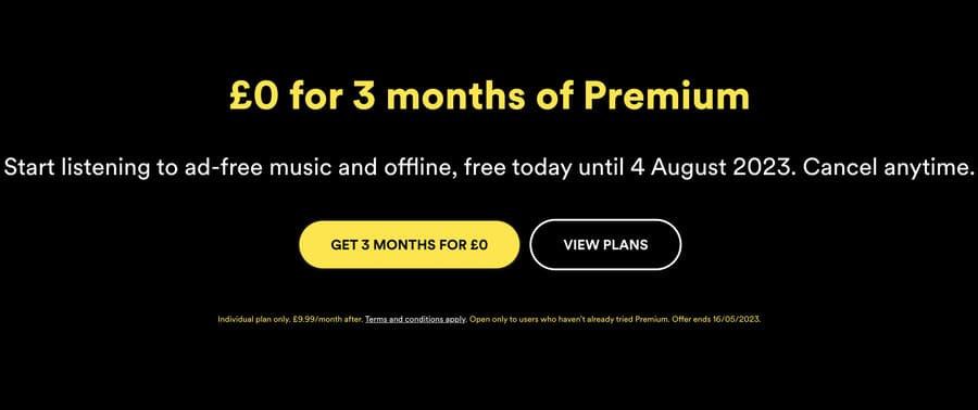
This specific call to action clearly communicates the benefit to the user, contributing to the streaming giant’s massive subscriber base.
2. Strike While It’s Hot: Ignite Action with Time-Sensitive CTAs
You know that feeling when you just gotta have something, like, yesterday?
That’s what urgency does.
It lights a fire under your audience, prompting them to take a specific action ASAP.
Create a Sense of Urgency
Adding a time-sensitive element to your offer can make all the difference. For example, compare:
“Get 50% Off”
And:
“Get 50% Off Today Only“
They both clearly state a generous discount, but the second option creates urgency by using a trigger word.
Sprinkling in words that convey immediacy, like “now,” “today,” or “limited time,” is like adding a pinch of spice to your marketing recipe.
It nudges users to act before it’s too late and can contribute to higher conversion rates.
Amazon’s Prime Day deals are a perfect example. They often include limited-time offers. These urgent messages help drive massive sales during their annual event.
Embrace Action-Packed Verbs
Energize your CTA by incorporating a powerful action word that inspires a visitor to take the desired action.
An action verb adds a layer of excitement and makes your call to action more compelling.
So, let’s explore a call to action example:
“Get Your Discount”
Vs.
“Snag Your Discount”
In the second option, the action verb “snag” adds an additional element, making the CTA more appealing and intriguing.
Remember, the right action word can work wonders in making your call to action irresistible and driving the desired outcome.
3. The Golden Ticket: Showcasing Irresistible Benefits for Instant Appeal
Wanna know the secret sauce that makes an effective CTA?
It’s all about the value proposition.
Show your audience exactly what they’ll gain by taking specific action.
Highlight the Benefits
Make your offer so enticing that a potential customer can’t refuse. Focus on the benefits they’ll receive. Let’s examine this example:
“Sign Up for Courses”
Vs:
“Get Instant Access to 100+ Premium Courses”
The first option is relevant but bland. Whereas the second highlights the value of instant access to a vast array of premium courses.
So, how could you highlight your benefit?
Focus On What Makes Your Offer Unique
Next, stand out from the crowd by showcasing what sets your offer apart.
So, ask yourself…
What is my USP (Unique Selling Point)?
Do you offer award-winning customer service? Are all your materials or ingredients organic? Do you have the strongest coffee?
In fact, Death Wish Coffee’s USP is exactly that:
“The World’s Strongest Coffee”
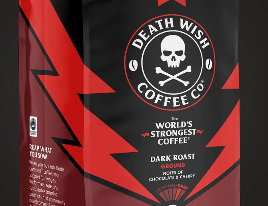
By highlighting its USP and converting it into a call to action button, Death Wish Coffee differentiates itself from competitors and encourages coffee lovers to experience it for themselves.
4. Pull at Their Heartstrings: Using Emotions to Inspire Action
Remember that time you bought something because it just felt right?
That’s the power of emotional appeal.
Let’s uncover the secrets of harnessing this persuasive force in your CTAs.
Use Persuasive Language
Choose words that tap into your audience’s emotions. After all, they should feel a connection with your CTA and brand. Consider this example:
“Enroll in Our Program”
Vs:
“Transform Your Life with Our Proven Program”
The second option tugs at the heartstrings by promising a life transformation.
Are you tempted?
A prime real-world example is Nike’s “Just Do It” slogan.
It evokes a sense of determination and encourages customers to take action and learn more by simply doing “it!”
Align with Your Audience
Speak directly to your audience’s desires and address their pain points head-on.
For example, if you’re marketing a sleep aid, which of these CTAs would you click:
“Try Our Sleep Aid”
Or:
“Say Goodbye to Sleepless Nights with Our Natural Sleep Aid”
The second one?
It addresses a common pain point amongst the target audience — sleepless nights — and offers a solution.
5. A Feast for the Eyes: Design Visually Stunning CTAs That Beg to Be Clicked
Looks matter, especially when it comes to CTAs. An eye-catching design can make all the difference between a click and a pass.
Implement Contrasting Colors
Color can be a powerful tool to grab attention.
So, make sure your CTA stands out with contrasting colors. Take a peak at the example from Smart Blogger below:
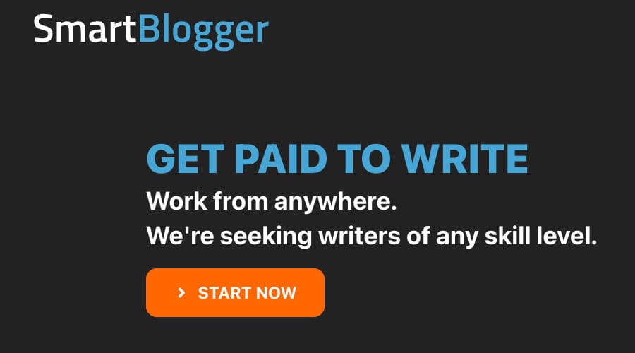
The “Start Now” button contrasts sharply with the website’s dark background. It effectively grabs the users’ attention and encourages them to click through.
Choose the Perfect Font
Don’t make your audience squint to read your CTA. Pick a font that’s clear and easy on the eyes.
Let’s jump back to the previous example from Smart Blogger…
The CTA uses a large, bold, and easily readable font to guide users toward their next action — great!
So, use clear typography to ensure users understand the desired action, ultimately driving sign-ups.
6. Unleashing the Power of Data: Fine-Tuning Your CTAs for Maximum Impact
You’ve crafted the perfect CTA, but your journey doesn’t end there.
To reach the pinnacle of success, testing, and optimization are your trusted companions on this quest for the best possible results.
Use AB Testing
Don’t rely on gut feelings. Test different CTA variations to see which one brings home the bacon.
For instance, suppose you’re running an online course platform, and you want to increase sign-ups for your latest offering.
You could test two different CTAs to see which one performs better:
1. “Enroll Now & Master Your Skills”
2. “Unlock Your Full Potential – Enroll Now”
After running your AB test and analyzing the data, you find that CTA 2 outperforms CTA 1 by a 15% higher conversion rate.
Perfect!
Based on these results, you implement CTA 2 into your marketing campaign, ultimately leading to a higher number of sign-ups for your online course.
Continuously Analyze Your Data
As seen above, data is your best friend.
So, keep a close eye on your CTA performance and continually make data-driven decisions.
If your latest CTA has a low click-through rate, consider tweaking the language, design, or placement.
If a particular element is performing above and beyond, rinse and repeat.
Your Ultimate CTA Arsenal: 54 Show-Stopping Examples to Boost Conversions Instantly
Now that you’re armed with tips and tricks, let’s dive into 50+ more compelling call to action button examples that’ll make your audience click like there’s no tomorrow…
Direct CTAs
1. “Buy Now”
2. “Sign Up Today”
3. “Download Your Free E-book”
4. “Start Your Free Trial”
5. “Get Started”
Urgency-Driven CTAs
6. “Limited Time Offer: Save 50% Today!”
7. “Join Now — Offer Ends Soon!”
8. “Don’t Miss Out — Register Now!”
9. “Only 3 Days Left: Enroll Now!”
10. “Get Your Early Bird Discount Today!”
Value Proposition CTAs
11. “Discover the Secret to Losing Weight”
12. “Get Your Dream Job”
13. “Boost Your Business Profits”
14. “Learn to Play Guitar Like a Pro”
15. “Unlock Unlimited Access”
Personalized CTAs
16. “See Your Customized Plan”
17. “Find Your Perfect Match”
18. “Get Personalized Recommendations”
19. “Your Journey Starts Here”
20. “Make It Yours”
Design-Focused CTAs
21. “Shop Our Best Sellers”
22. “Upgrade Your Wardrobe”
23. “Find Your Perfect Look”
24. “Discover the Latest Trends”
25. “Get Inspired”
Social Proof CTAs
26. “Join Thousands of Happy Customers”
27. “Get the #1 Rated App”
28. “Find Out Why We’re the Top Choice”
29. “Trusted by Experts Worldwide”
30. “See the Success Stories”
Emotional Trigger CTAs
31. “Don’t Live With Regret — Act Now”
32. “Stop Feeling Overwhelmed — Get Organized”
33. “Become the Person You’ve Always Wanted to Be”
34. “Discover Your True Potential”
35. “Find Happiness Today”
Guarantee-Focused CTAs
36. “100% Money-Back Guarantee”
37. “Risk-Free Trial”
38. “No Questions Asked Returns”
39. “Get Results or Your Money Back”
40. “Try It RISK-FREE for 30 Days”
Exclusive CTAs
41. “Grab Your Exclusive Discount Code”
42. “Get Your VIP Access”
43. “Unlock Secret Features”
44. “Experience the Future of Technology”
45. “Join Our Elite Membership”
Information-Seeking CTAs
46. “Learn More”
47. “Request a Demo”
48. “Get Your Free Guide”
49. “Download Our Whitepaper”
50. “Schedule a Consultation”
Community-Building CTAs
51. “Join Our Facebook Group”
52. “Follow Us on Instagram”
53. “Subscribe to Our YouTube Channel”
54. “Share Your Experience”
55. “Invite a Friend and Get Rewarded”
The Call to Action Revolution: Unleash the Potential of Your Campaigns
With these effective call to action tips and examples in your arsenal, you’re ready to conquer the world of clicks, conversions, and delighted customers.
So let the journey begin, and may the power of persuasion be with you.
Happy marketing!
The post 50+ Call-to-Action Examples That’ll Elevate Conversions (2024) appeared first on Smart Blogger.

No comments:
Post a Comment