Do you want to customize your WooCommerce checkout page?
The default WooCommerce checkout page isn’t optimized for conversions. By customizing and optimizing your checkout page, you can increase your conversions and make more sales.
In this article, we’ll show you how to easily customize your WooCommerce checkout page, step by step without writing any code.
Why Customize WooCommerce Checkout Page in WordPress?
Studies show that between 70 – 85% of all carts are abandoned. In other words, majority of users are leaving your checkout pages without making a purchase.
Creating a custom WooCommerce checkout page gives you a final opportunity to turn a website visitor into a customer before they leave your store.
With a custom checkout page, you can add testimonials / social proof elements to build trust, add related products to boost revenue, and optimize the overall page layout for better conversions.
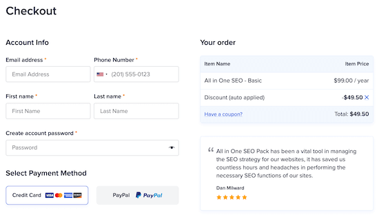
All of these will elevate conversions and make it more likely your visitor will become a long-term customer.
Before you move forward, you may also want to customize your WooCommerce cart page to improve conversions here too.
If you’re using WooCommerce’s cart and checkout pages together, then you’ll want these pages to have similar branding to offer your visitors a great checkout experience.
By customizing these together, you can improve your overall conversions and earn more revenue. For more details, see our guide on how to create a custom WooCommerce cart page without writing any code.
With that said, let’s take a look at how you can easily customize your WooCommerce checkout page and make more money from your online store.
How to Customize Your WooCommerce Checkout Page in WordPress
SeedProd is the best drag and drop WordPress page builder used by over 1 million websites. It lets you easily customize your WooCommerce checkout page to make more sales.
First thing you need to do is install and activate the plugin. For more details, see our step by step guide on how to install a WordPress plugin.
Note: there is a free version of SeedProd that’s available, but for this tutorial, we’ll show the Pro version since it has built-in WooCommerce blocks.
Once the plugin is activated, go to SeedProd » Settings and enter your license key.
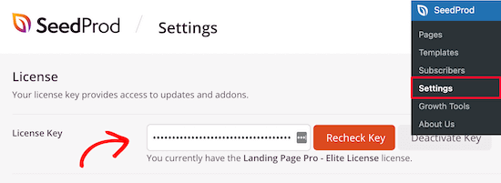
You can find this information under your account page on the SeedProd website.
After that, navigate to Seedprod » Pages and then click on the ‘Add New Landing Page’ button.

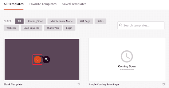
Next, you’ll be asked to choose a landing page template. There are dozens of professionally designed templates for you to choose from.
You’ll notice that the templates are filtered by different categories. Choosing a template category that matches the type of page you want to create can help you build your page faster.
With that said, every template can be fully customized, no matter which template you choose.
For this tutorial, we’ll select the ‘Blank’ template since this lets us build the exact kind of checkout page we want.
To select a template, hover over it and click the ‘Checkmark’ icon.
After that, you’ll be asked to name your page. The page name will also match the URL for your checkout page.
Then, click the ‘Save and Start Editing Page’ button.
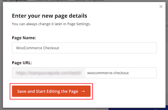
This will take you to the drag and drop editor, where you can build your custom WooCommerce checkout page.
The right side will be your page preview, and the left side is the options panel to help you customize.
First, we’ll add a header so that you can maintain your branding.
To do this, click on the ’Sections’ menu option in the left hand panel and then click the ‘Header’ category.

After that, hover over the ‘Header 1’ template and click the ‘Plus’ icon.
Next, click the ‘Image’ section of your page and upload your store logo on the left hand menu.
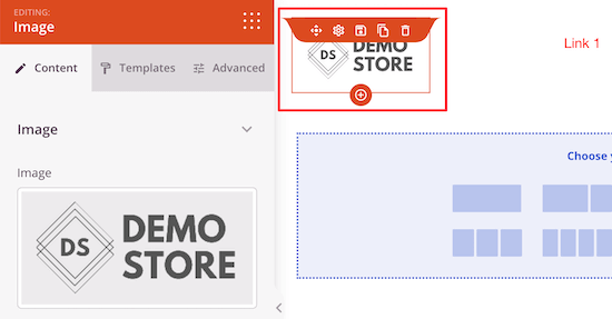
Then, you can delete the navigation menu by hovering over it and clicking ‘Delete Block’.
Deleting the other menu items reduces the number of page exits and makes it more likely your visitor will complete their purchase.

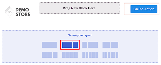
Once you’ve done that, click on the button labeled ‘Call to Action’.
We’re going to change the text so it says ‘View Cart’.

This lets your users go back to their cart page to add items or change the quantity.
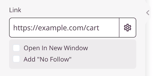
Then, add the URL of your WooCommerce cart page to the box labeled ‘Link’.
You can make the link nofollow or open in a new tab, but we’ll leave the default settings.
Next, click the content and sidebar layout in the ‘Choose your layout:’ section.
This lets you create a section for your checkout, plus a recommended product section.
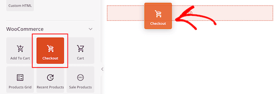
After that, locate the ‘Checkout’ block in the WooCommerce section and drag it over to your page.
You can completely customize how your checkout looks, including the color scheme, font choice, link color, buttons, and more.
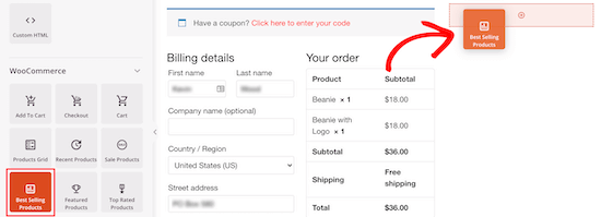
Next, you can add a popular products or recommended products section. This lets you improve your sales by promoting other products shoppers could be interested in.
To add this, simply drag over the ‘Best Selling Products’ block from the ‘WooCommerce’ section.
You can choose any of the other WooCommerce product blocks as well.
Next, you can add a headline above the popular products.
Simply drag the ‘Headline’ block over to your page above the popular products. You can customize the font, size, text, color, and more.

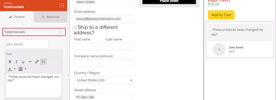
Once you’ve done that, you can add a testimonials block. This acts as social proof and assures your visitors they’re making the right decision.
Find the ‘Testimonials’ block and drag it underneath your popular products.

The testimonials block can be completely customized.
You can add a customer photo, job title, and more.
Another thing you can do to improve social proof even more is add a star rating right under your testimonial.
Simply select the ‘Star Rating’ block and drag it under your testimonial.

After you’re done customizing your WooCommerce checkout page, you can make it live by clicking the drop down arrow next to the ‘Save’ button and select ‘Publish’.

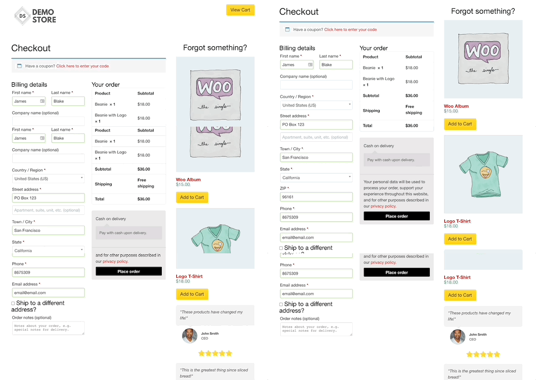
Now, instead of the default WooCommerce checkout, you’ve created a high converting WooCommerce checkout page.
Feel free to continue customizing your page and testing out different elements, sections, and blocks.
Pro tip: you can track your WooCommerce checkout page performance to see if your customizations are improving revenue. For more details, see our step by step guide on how to setup WooCommerce conversion tracking.
Assign Your Checkout Page to WooCommerce
Once you’ve finished customizing your checkout page and made it live, you need to change the default WooCommerce URL settings.
Changing the URL makes it so your customers will automatically go to your new WooCommerce checkout page, instead of the default option.
First, go to WooCommerce » Settings and click on the ‘Advanced’ tab.
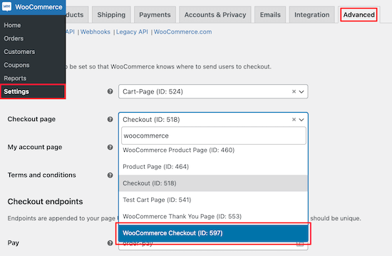
Then, select the new WooCommerce checkout page URL from the drop down menu.
Make sure to click ’Save changes’ at the bottom of the screen.
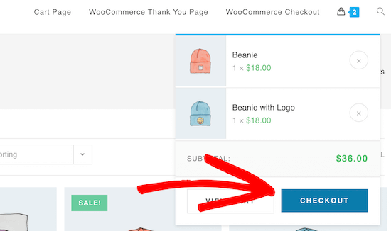
Now, when a visitor clicks ‘Proceed to checkout,’ they’ll be taken to your new, high converting page you just built.
Some WooCommerce themes even give customers the option of going straight to the checkout page.
How to Reduce Checkout Page Abandonment
Checkout page abandonment is when a customer starts the checkout process, but doesn’t complete their payment. It’s similar to cart abandonment, but it’s one more step towards completing payment and becoming a customer.
Customizing your checkout page with the tutorial above will go a long way towards optimizing your checkout page for conversions.
However, there are a few things you can do to reduce checkout abandonment further.
Reduce Any Addon Checkout Charges
When customers get to their cart, they expect the total price to be similar to the total product prices.
If they get to checkout and see taxes, high shipping costs, and other additional fees, then there’s a good chance they won’t complete the purchase.
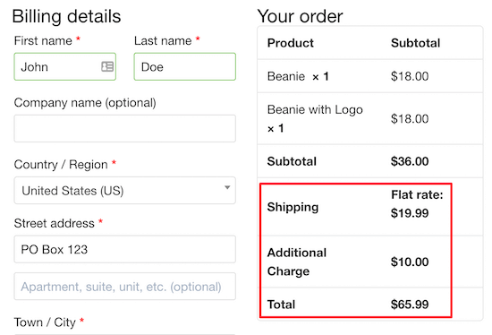
A customer might continue with the purchase if they think the costs are justified. However, the best thing to do is be upfront with your pricing.
If you have a lot of additional fees for fulfilling your products, then add these to your total product prices. Or, explain the reason for the additional costs.
Amazon was able to dominate the eCommerce space by offering free 2-day shipping.
Consider offering free shipping on your products or offering free shipping to orders above a certain amount.
Make Account Creation Optional or Simpler
Requiring account registration before completing a purchase can lead to abandonment. This can increase your email subscribers, but it adds more friction to the buying process.
You can allow your users to create an account, but you don’t have to make it a requirement.
Instead, you can set up a registration form to grow your email list after the user completes their purchase.
You can also simplify the required fields on the checkout page. If you need to collect more information, then you can do that after checkout.
The goal should be to eliminate as many fields (friction points) from user’s way, so they can complete the purchase.
Offer More Checkout Payment Options
Another reason your visitors won’t follow through with the checkout process is that you don’t offer enough payment options.
Your online store should provide the most common payment options.
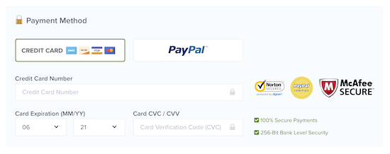
Your customers will use the payment method that’s most convenient for them.
For more details, see our list of the best WooCommerce payment gateways for WordPress.
We hope this article helped you customize the WooCommerce checkout page easily. You may also want to see our expert picks of the best WooCommerce hosting, and our list of the best WooCommerce plugins for your store.
If you liked this article, then please subscribe to our YouTube Channel for WordPress video tutorials. You can also find us on Twitter and Facebook.
The post How to Customize WooCommerce Checkout Page (The Easy Way) appeared first on WPBeginner.

No comments:
Post a Comment